![]()
![]()
ggquickeda is an R Shiny app/package
providing a graphical user interface (GUI) to ggplot2 and
table1.
It enables you to quickly explore your data and to detect trends on the fly. You can do scatter plots, dotplots, boxplots, barplots, histograms, densities and summary statistics of one or multiple variable(s) by column(s) splits and an optional overall column.
It also has the km, kmband and
kmticks geoms/stats to facilitate the plotting of
Kaplan-Meier Survival curves.
For a quick overview using an older version of the app head to this Youtube Tutorial . A more recent video tutorial can be found here: Certara R School Introduction to ggquickeda .
# Install from CRAN:
install.packages("ggquickeda")

# Or the development version from GitHub:
# install.packages("remotes")
remotes::install_github("smouksassi/ggquickeda")
To use your pre-existing csv file launch the shiny app then navigate to your csv file and load it.
run_ggquickeda()To use your data that is already in R launch the shiny app with the dataset object as an argument:
run_ggquickeda(myRdataset)The best way to learn how to use ggquickeda is to load a data your are familiar with and start experimenting. Try to reproduce the steps below using the included sample_df.csv. This will give you an idea about the visuals and summaries that can be generated.
The package has also the following vignettes:
vignette("ggquickeda")vignette("AdditionalPlotsStats")vignette("Visualizing_Summary_Data")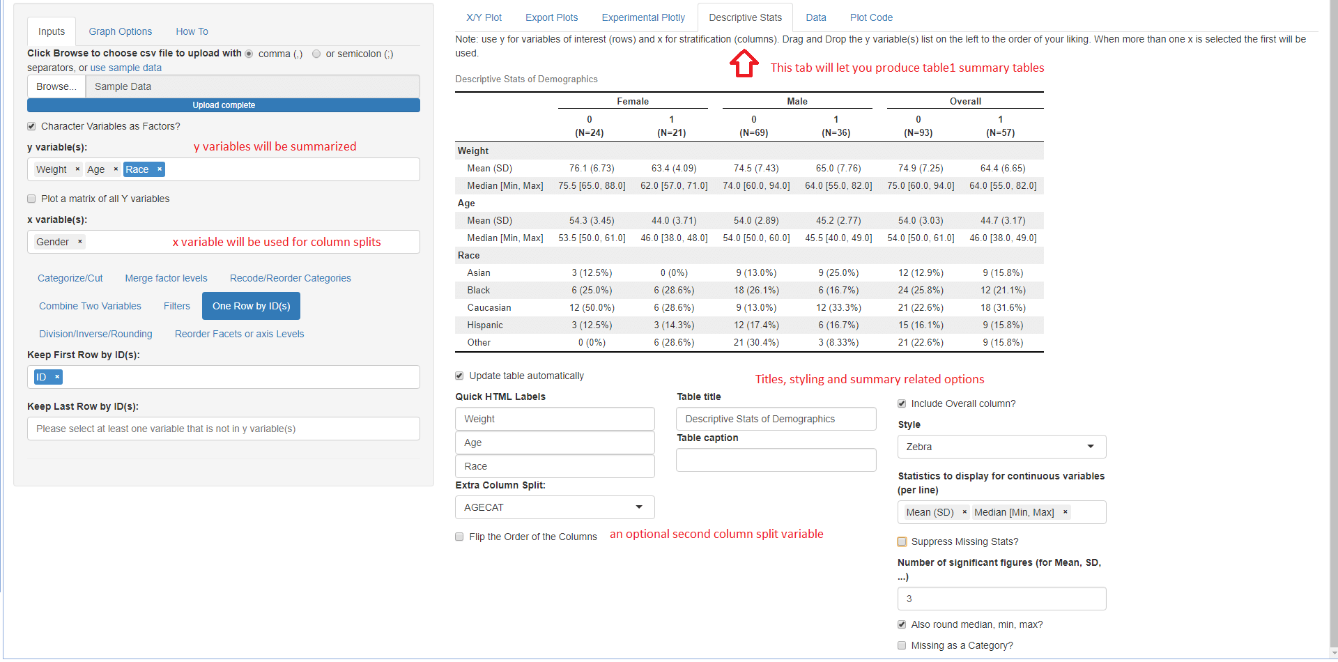
The Export Plots and Plot Code tabs
were contributed along many other additions and capabilities by
Dean Attali.
Once a plot is saved in the X/Y Plot tab by providing a
name and hitting the Save plot star button it will
become available for exporting. You can export in portrait, landscape
and multiple plots per page.
The Plot Code tab will let you look at the source code
that generated the plot with the various options. This is helpful to get
you to know ggplot2 code.
The Quick summary statistics tables using
Benjamin Rich
table1 package.
Here is a high level overview of some of the things that can be done with the various menus:
Choose csv file to upload or use sample data This execute the code to load your csv file or the internal sample_data.csv:
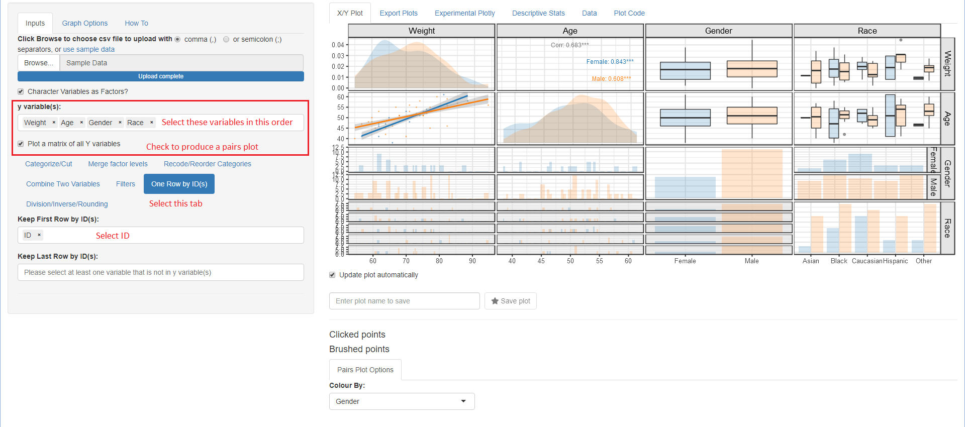
read.csv("youruploadeddata.csv",na.strings = c("NA","."))Once your data is uploaded the first column will be selected for the y variable(s): and the second column for the x variable:, respectively. A simple scatter plot of y versus x variables is shown. ggquickeda can handle one or more y variable(s) selections and more recently one or more x variable(s). Note that the x variable(x) should be different from those selected for y variable(s). Whether the user selects one or more y variable(s), the y variable(s) data will be automatically stacked (gathered) into two columns named yvalues (values) and yvars (identifier from which variable the value is coming from) and a scatter plot of yvalues versus x, faceted plot by yvars will be shown. Mixing categorical and continuous variables will render all yvalues to be treated as character. The order of the selected y variables(s) matters and can be changed via drag and drop. Selections can be removed by clicking on the small x. When no y variable(s) is selected a histogram (if x variable is continuous) or a barplot (if x variable is categorical) is shown.
The same applies when ore or more x variable(x) where the values are named (xvalues) and the identifier variable name is (xvars). When no x variable(s) is selected a histogram (if y variable is continuous) or a barplot (if y variable is categorical) is shown.
After selecting your y variable(s) if any and x variable you can directly proceed into data manipulation within the Inputs tab using the following subtabs. Note that the subtabs execution is sequential i.e. each subtab actions are executed in the order they appear. If the user changes an upstream action this will reset the subsequent ones.
table1::eqcut. Additional
options is to treat zero as separate category (Placebo) and or to treat
missing as a separate category as well.Various options to tweak the plot: * Controlling y and x axis labels, legends and other commonly used theme options. * Adding a title, subtitle and a caption * Controlling color palette, themes, reference lines and more.
A shorter version of this walk-through within the app.
Main plot is output here with the various options to generate the plot below the possibilities include:
ggplot2 built-in functionality for Group, color, size, fill
mappings as well as up to two variables for column and row splits
(faceting).Installing the package should handle the installation of all dependencies.
The app can also be directly launched using this command:
shiny::runGitHub('ggquickeda', 'smouksassi', subdir = 'inst/shinyapp')